Like everyone else, we have been closely following news and analysis of the disease dynamics that have been developing as states have gradually eased the “safer at home” provisions that were implemented in late March and early April. In this case, for investors, reality is ultimately more significant than public perceptions of that reality. Public perceptions may help drive short-term stock market movements, but the underlying reality is critical to developing a correct strategic vision. Fortunately, there are a lot more data available now to help investors reach the underlying reality than there were three months ago.
In what follows we do not pretend to be virologists or epidemiologists; we are simply interested lay observers striving for analytical objectivity and making use of the best data we can find.
Although rising infection rates have captured the attention of media, we believe that the most import figures are the infection mortality ratio and the direction of daily disease mortality. Are daily deaths rising or falling? Testing tells us that more tests are being conducted; the rate of positives among those tests tells us that more people are contracting the disease. However, we know that covid-19 is an illness which strikes vulnerable populations with a lethality that is probably ten times greater than that of the less-vulnerable population.
In the CDC’s “best estimate” scenario, the infection fatality rate (IFR) overall is about 0.26%. Note how far this is from the early projections of a 3–5% mortality rate which are still repeated by some uninformed news sources.
However, for those under 40, it is 0.03%, with a worst-case scenario of 0.08% — less lethal than seasonal flu, and perhaps much less lethal. For those over 65, it is 0.85% (and their worst-case ratio for this age group is 2.6%) — much more lethal than seasonal flu.
Research from Stanford epidemiologist Dr John Ioannidis helps refine these data still further by separating out mortalities that lack any underlying medical conditions (diabetes, obesity, hypertension, and recent experience with cancer are all among the most common of these risky underlying “co-morbidities”). According to Dr Ioannidis’ analysis, the risk posed by covid-19 to healthy individuals under 65 is so small as to be statistically insignificant — orders of magnitude less than the risk posed by an average daily commute.
If those testing positive are mostly from this less-vulnerable majority, we would expect to see mortalities to remain low, even as positive test results rise.
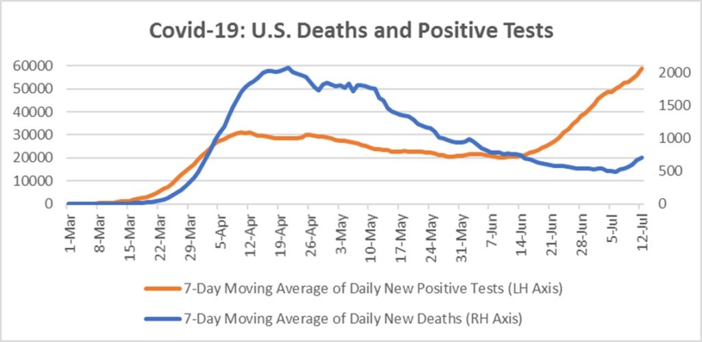
Daily new positive tests inflected sharply upward in mid-June, reaching a level nearly double that of early April, likely as a result of re-opening, community spread mostly among the young, and more widespread testing. In the second week of July, daily new mortalities also began to rise, albeit more slowly, and remain 60–70% below the late April peak.

Media reporting on covid-19 mortalities often confounds total deaths with daily deaths, with charts frequently depicting total deaths to date. Although technically accurate, this presentation of the data can be misleading, if it gives the impression that deaths are at new highs. Of course, total deaths are always going to be at new highs, but daily deaths have only just inflected off their low, and remain low.
These trends have persisted into the initial reopening phase, well past the disease incubation period — in spite of the widespread protests against police brutality and systemic racism where many protesters did not wear masks or take other precautions to avoid infection.
What seems to be happening is just what U.S. strategists such as Dr Fauci aimed for in their initial response. The curve was flattened, and we ensured that hospitals would not be overwhelmed. Most importantly, we bought time for the medical community to develop some best practices in disease treatment, and we accurately identified vulnerable populations so that we could better protect them.
Now that the lockdowns are being lifted, the disease is inevitably spreading among the less vulnerable population, where eventually, it will create a “wall” — so-called “herd immunity” — to protect the more vulnerable. This process will be hastened when and if a vaccine is developed, but even if Covid-19 proves intractable to vaccinate against (like its cousins SARS, MERS, and the common cold), herd immunity will still happen, albeit more slowly. And this is leaving aside the possibility that many people already have a measure of immunity from their previous exposure to other coronaviruses such as the common cold.
Investment implications: If this analysis is correct, we may be further towards a post-covid “normal” than one would think from reading mainstream news coverage. In part, this could be what the stock market is pricing — and may help explain the puzzling disconnect between the stock market’s action after the pandemic lows, and the media’s ongoing anxious reporting about the virus.


